Seneca College - Improving website organization and design to increase registration conversion rate
Role
UX Designer
Team of: 1 graphic designer, 2 software developers
Duration
Nov 2023 - Dec 2023
Platform
Responsive Web
Figma, Google Suite, FigJam
Tools


🙋♀️ Problem
Existing hackathon website has poor navigation resulting in users wanting to register.
👩🎨 Solution
Improve site information architecture and establish a design system to improve navigation.
Utilize more CTA buttons to encourage registration.
⚡️ Impact
Increased conversion opportunity by 200%
Expected 600 participants with 60 projects accepted and more viewing the website
Context
This annual hackathon hosted by Seneca College in Toronto offers students an opportunity to collaborate and showcase their solutions to a new problem every year. The hacakthon team wants to ensure they match and exceed the number of registrations in comparison to years past.
Project Challenges and Constraints
Collaborating with graphic designer to finely balance design aesthetics and UX principles during design system development
Short turnover timeline resulting in immediate mid to hi-fi construction, iterating along the way
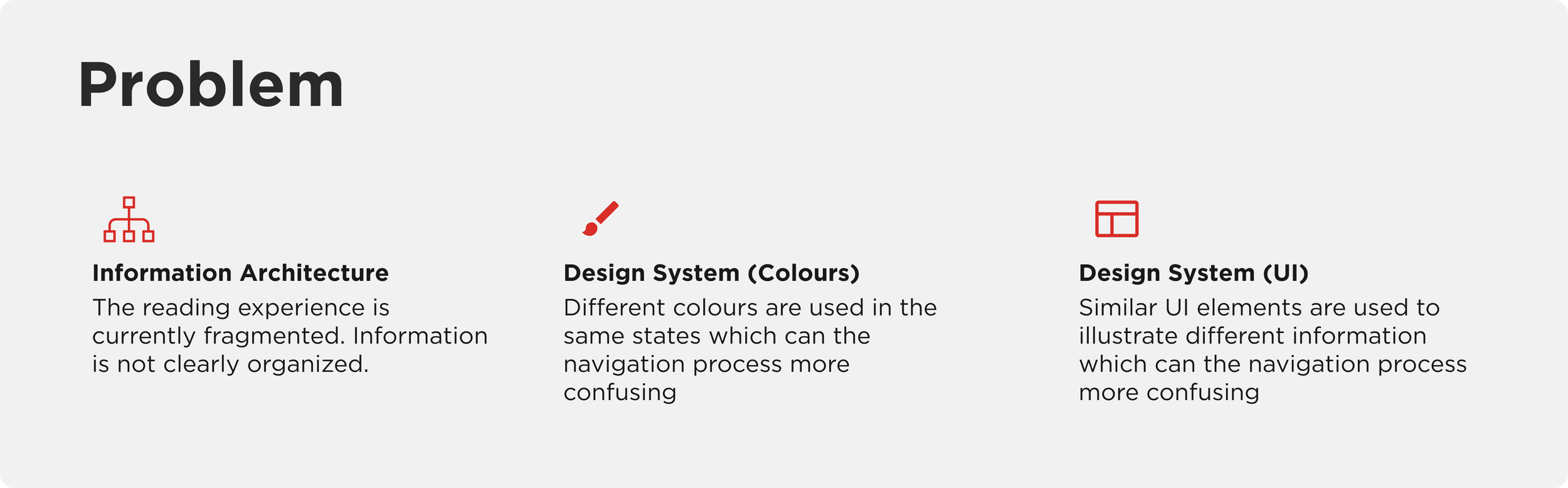
Problem
Poor navigation affecting registration conversion
It was identified prior to my involvement that users had trouble navigating the home page. There was confusion regarding the site content and difficulty discerning information between past and present hackathons. Users also had hesitation and found it annoying that they had to go all the way back to the header to register for the hackathon. These moments of frustration can impact the school’s goal of encouraging participant registrations.
The Design Process
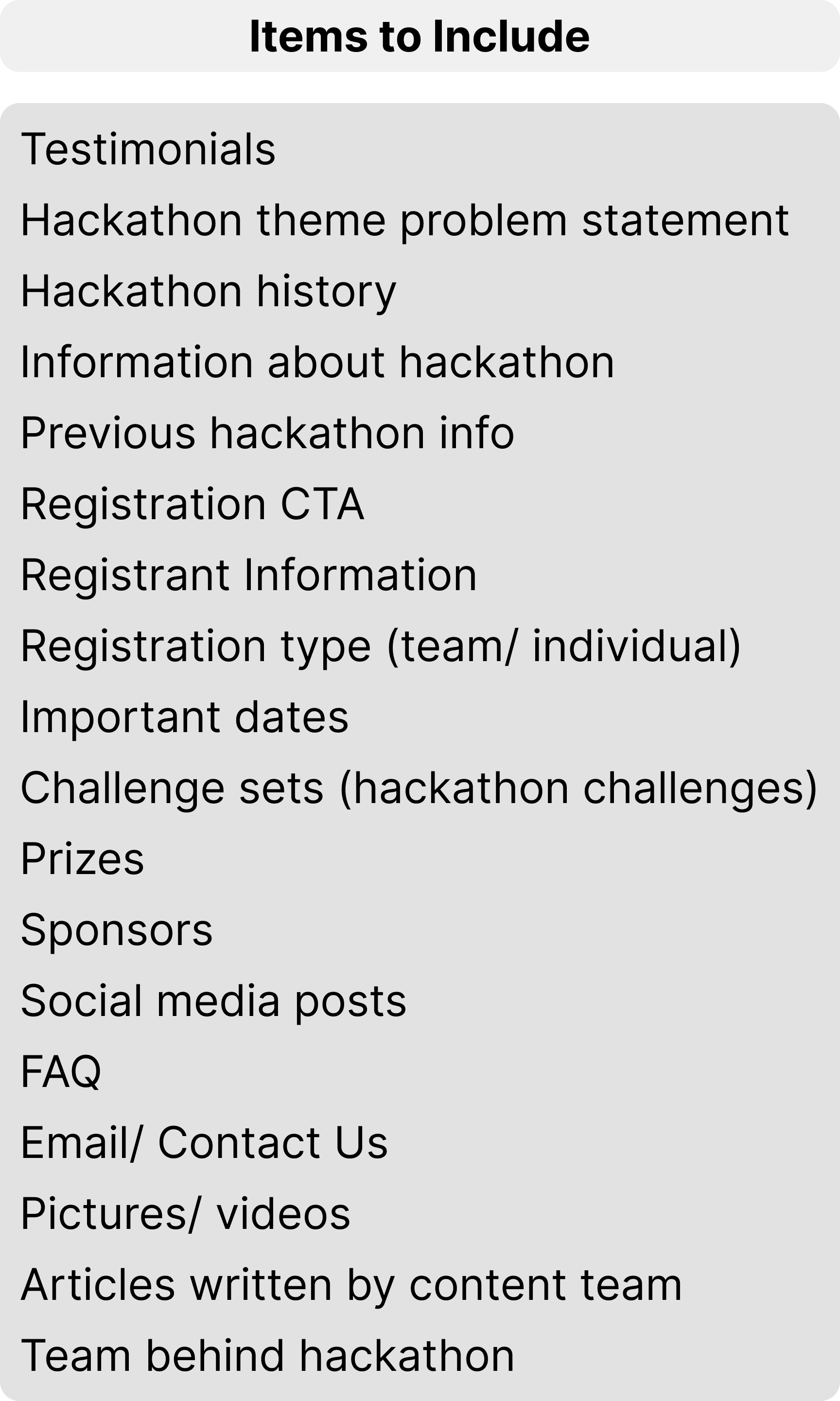
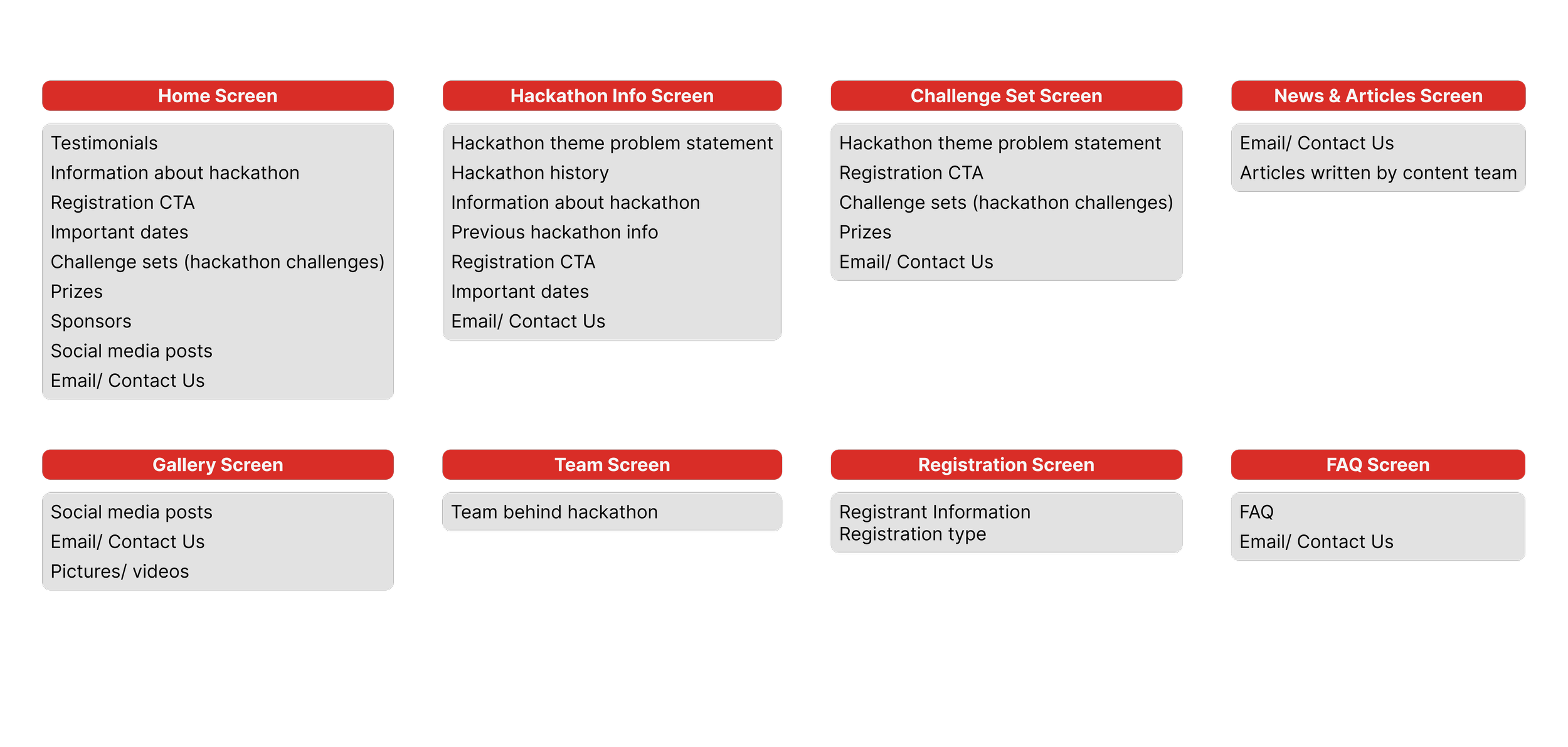
Utilizing card sorting and value proposition to improve website information architecture
I consulted with the client to identify which information they thought to be most important and should reside on the home page. We conducted card sorting sessions to determine which page each information should reside and created new screens to sort other items. Additionally, we discussed the value proposition of each item, and placed the most important items highest on the site for visual hierarchy.
→
card sorting
Developing a consistent design system
To improve on website readability and ease site navigation, I also helped the client create a design system to ensure consistency on future use-cases. I focused primarily on creating a colour palette in order to utilize the same colours to denote the same actions. I rounded off the design system by ensuring consistency in spacing and type.
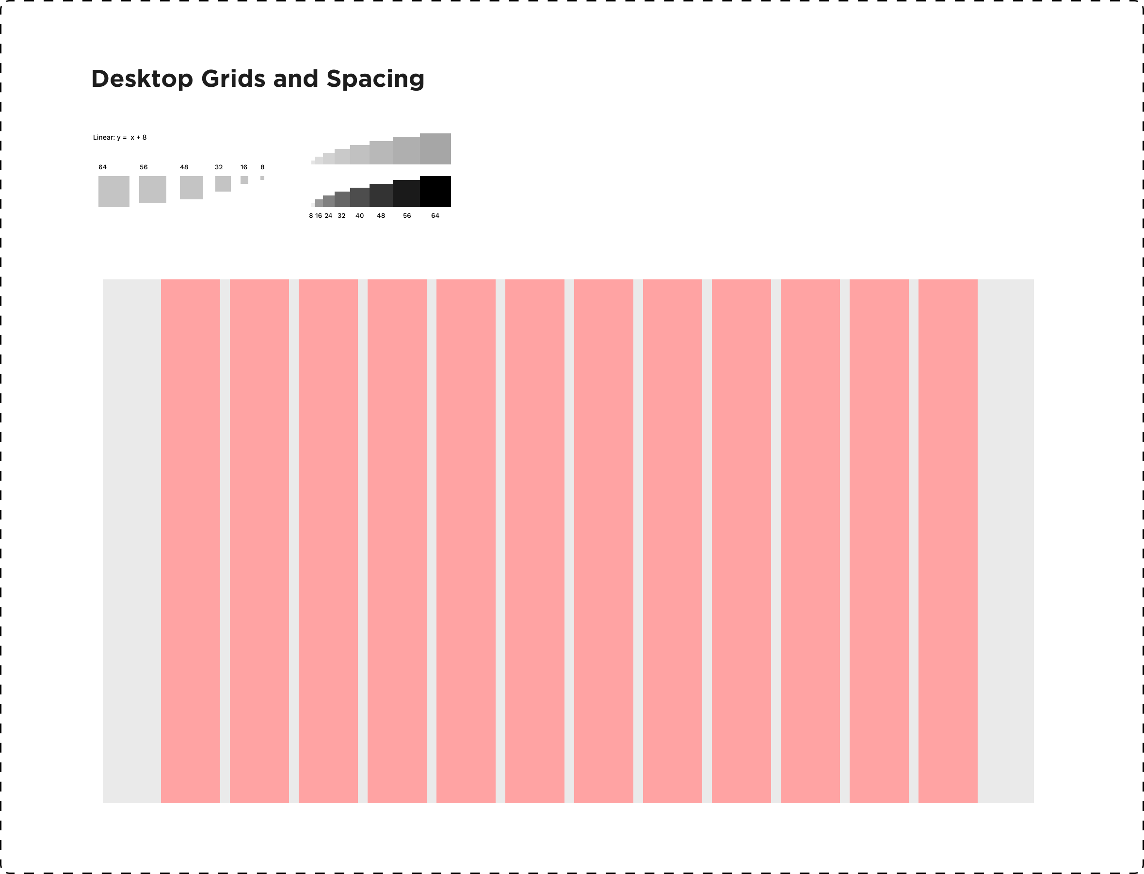
Foundations
I utilized an 8pt grid system to size and space elements and a 12 column system as I can easily space out elements in 2’s, 3’s, 4’s, and 6’s.
Both will help maintain consistency in spacing between elements regardless of screen size as most screens are divisble by 8.
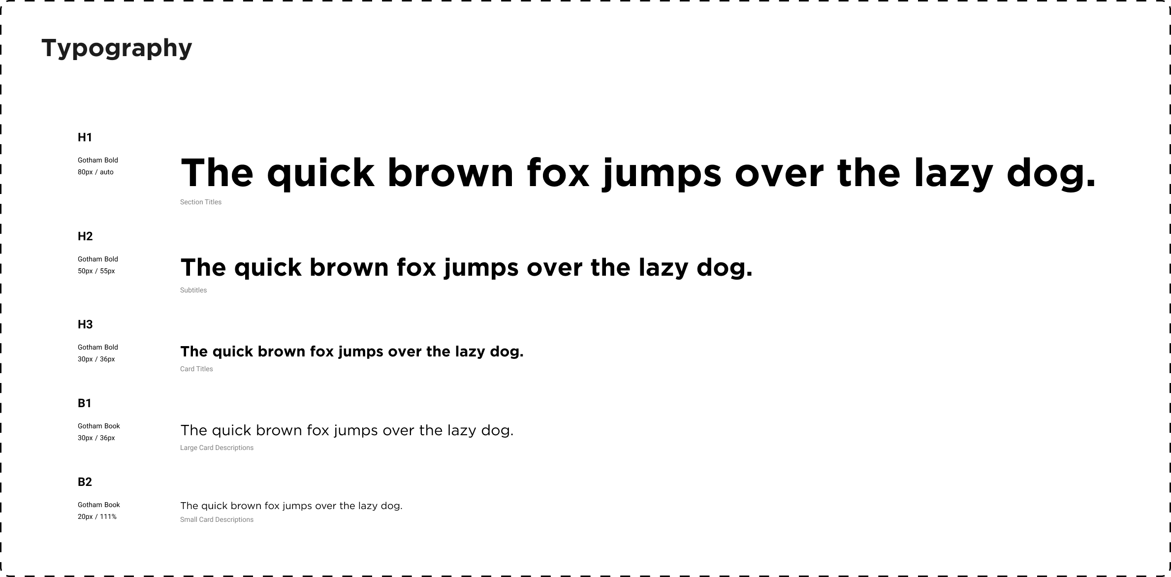
Typography
The lead graphic designer decided to use the Gotham type as this typeface has many versatile fonts. Type sizing were in increments of 30, 20, and 10 to be used for visual heirarchy.
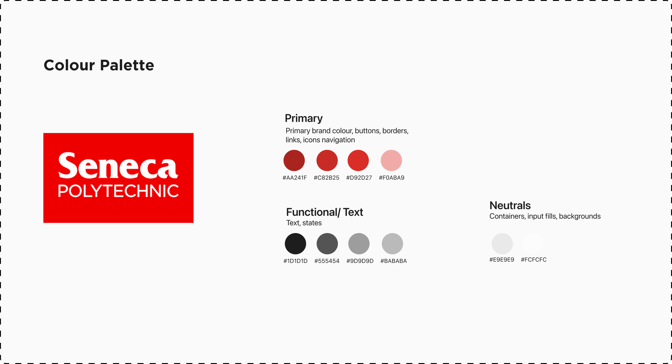
Colour Palette
I used the Seneca College brand colour of red as interactive states helps the reader differentiate between text and interactive buttons and links.
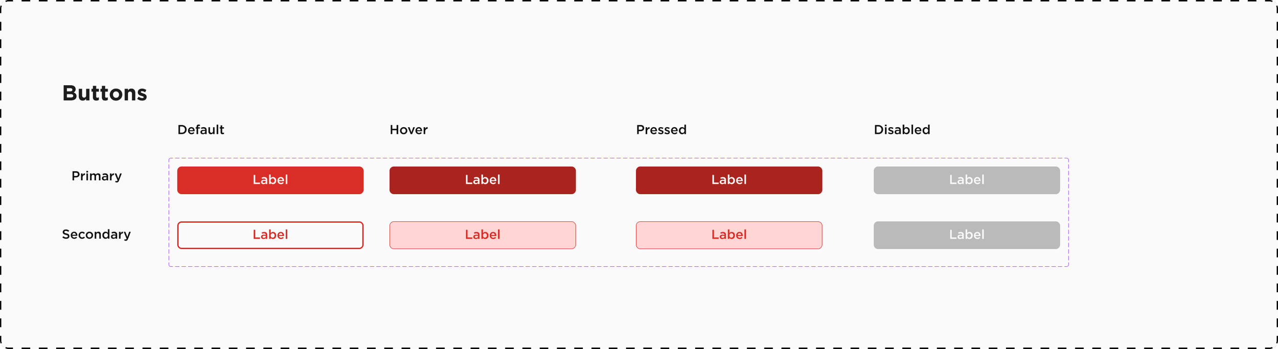
Buttons
Buttons were categorized into two main types: primary and secondary buttons. Each button type was further categorized into default, hover, pressed, and disabled states.
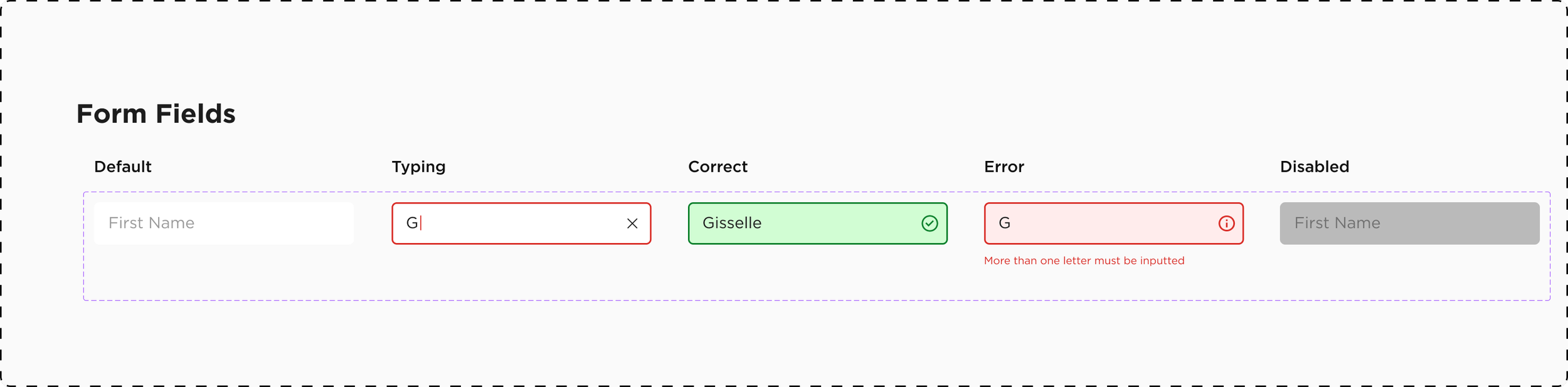
Form Fields
Form fields used a similar colour palette to buttons. Form fields were categorized into default, typing, correct, error, and disabled states.
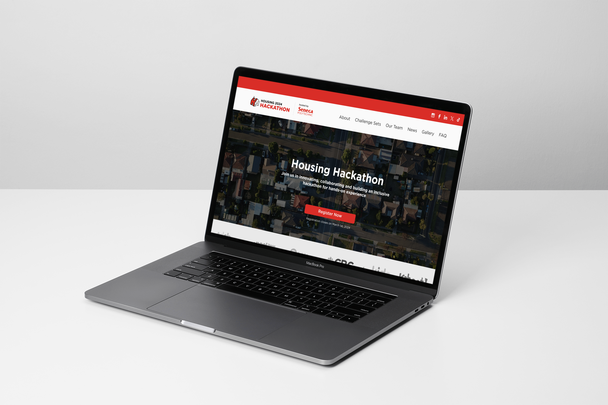
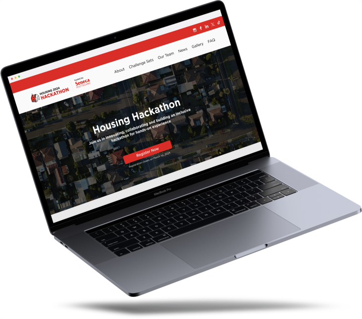
Solution
A simplified design focused on visuals and CTA buttons to increase registration
The client initially wanted the home page to act as a one-stop shop for all hackathon information. However, this resulted in a long home screen with large blocks of text and fewer pictures which may continue to discourage users from registering. In the final design provided to developers, we focused on using visuals to present information, and relying on CTA buttons to redirect viewers to additional hackathon information or to registering.
Impact
👓 Improved site navigation and readability
increased registration conversion opportunity by 200% using CTA buttons
revised site information architecture in order to improve site navigation
created design system to maintain consistency in site design, focusing on incorporating brand colours to denote actions
⚡️ 600 participants and 60 projects expected to be accepted
many more accessing and viewing the developed website