Integrating Legacy Software to an Existing Workflow
LawyerDoneDeal - RealtiWeb Web Application
2024 - 6 months
I integrated a 20 year old legacy 3rd party application used by over 7500 legal professionals into one of RealtiWeb’s largest user demographics. Our aim was to streamline lawyer and clerk workflow and reduce fragmentation by allowing users to complete their work all from one application.
This project is under a NDA and the context has been altered to protect confidential information.
While the context has been adapted to focus on loan applications, the design process, challenges, and solutions accurately reflect the nature of the original work. For more information, please contact me for more information about this project and my experience at LawyerDoneDeal.
Role
UX Designer
Team
1 Design Lead, 1 Developer, 2 Project Managers, 1 Business Development Manger, 1 Head of Sales
Platform
Responsive Web
RealtiWeb is a leading Canadian conveyancing software designed for real estate lawyers and clerks to complete and close legal transactions. It offers tailored solutions unique to each province’s laws and regulations.
As the UX designer, I designed the integration of Loan2*, a legacy loan application used by over 7500 finance professionals, into RealtiWeb. In several provinces, the software has already been integrated with its provincially regulated loan application. This integration will help serve one of our highest client-base provinces.
Context
*This project is under a NDA and the context and names have been altered to protect confidential information.
The Problem
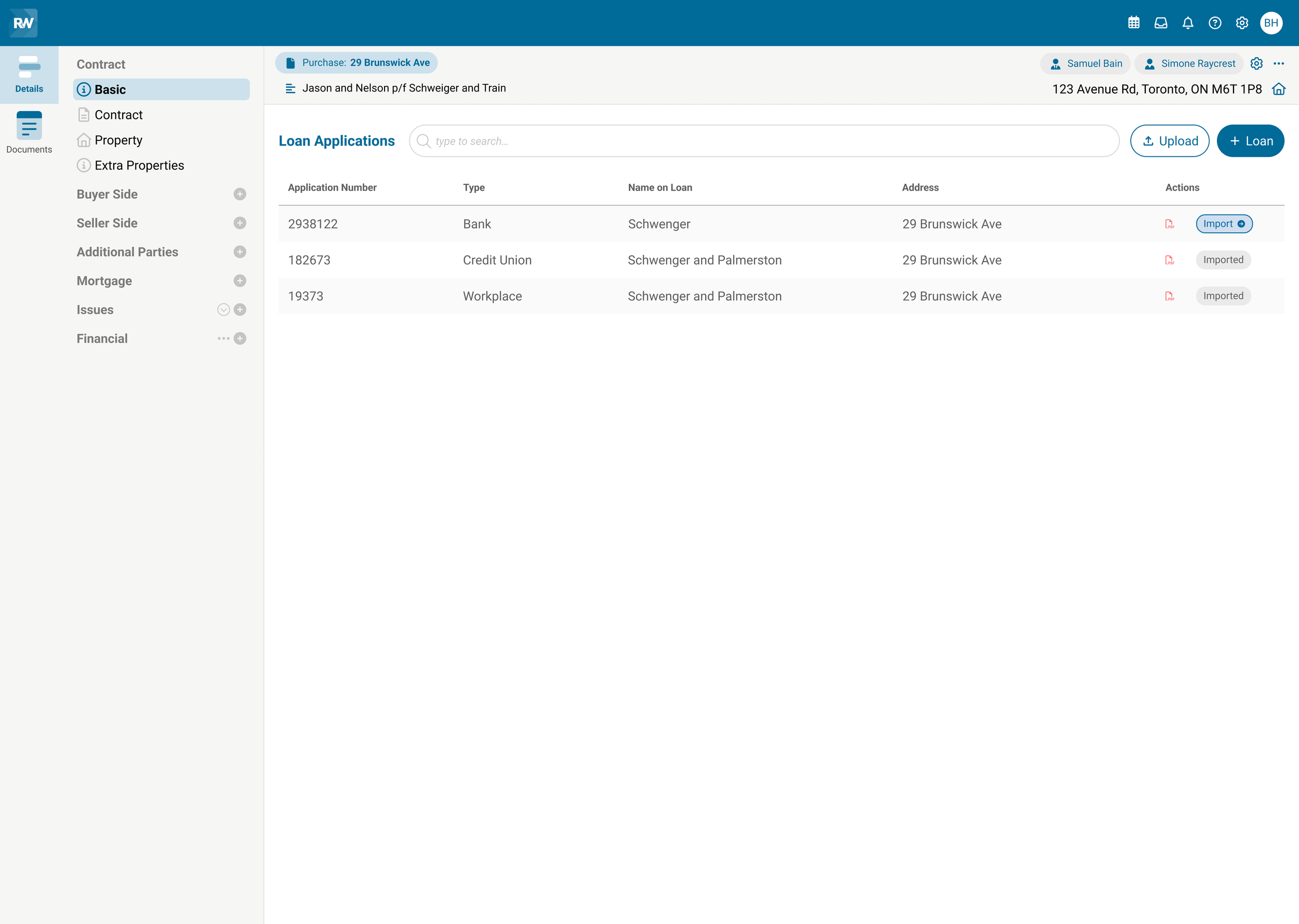
When users applied for a loan on the Loan2 application, they were presented with a confusing interface. As a first timer, the process was not intuitive, inefficient, and disjointed. There were several key issues contributing to this problem:
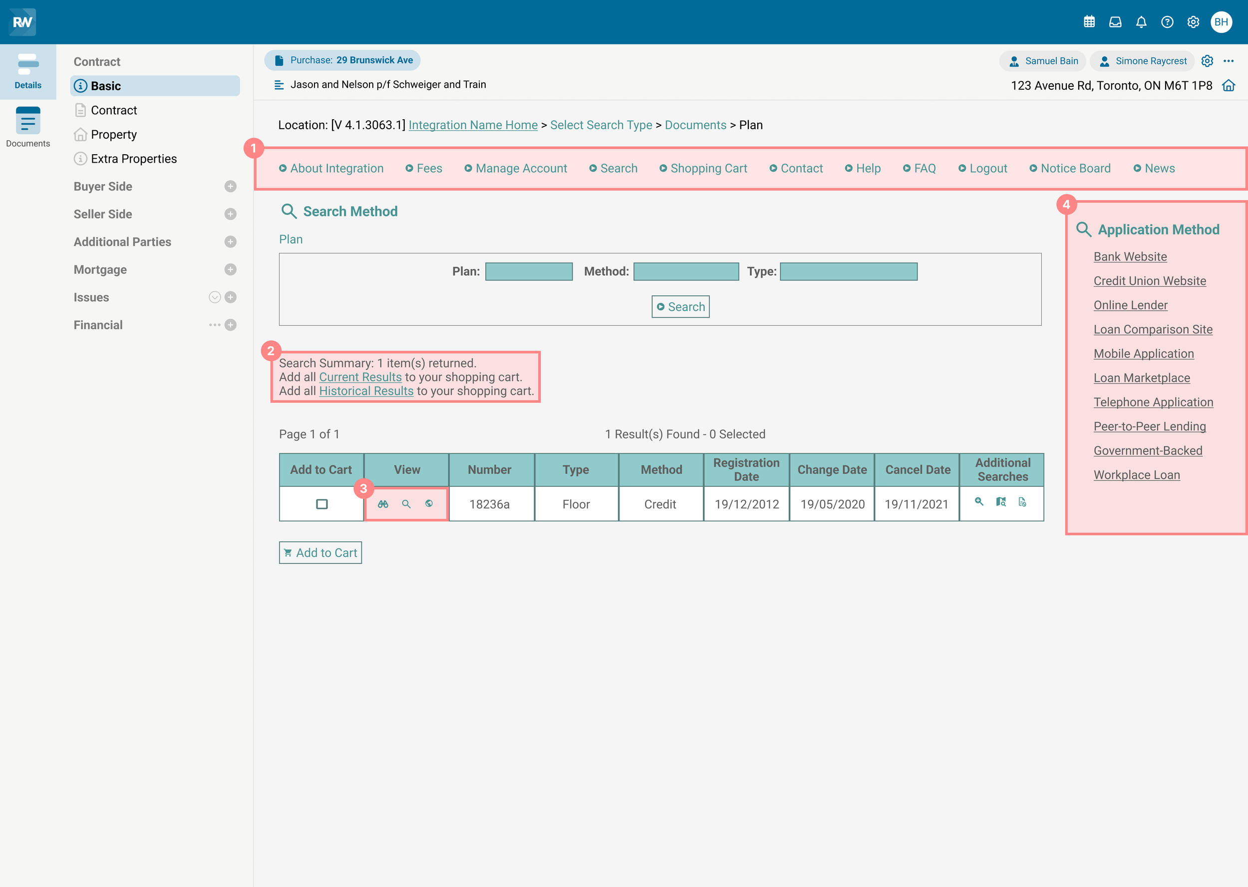
1. Disorganized navigation. The workflow lacked a clear starting point, requiring users to frequently switch between the search and shopping cart to verify their selections.
2. Invisible products. Users were able to add products that were not visible in the results table, creating confusion.
3. Unfamiliar icons. The system utilized non-standard icons that were uncommon in modern applications, making it unclear what actions they represented.
4. Visual clutter and multitasking. Users had the ability to initiate a new application without completing their current one, resulting in an overwhelming interface and difficulty navigating.
My Objectives
A clearer, simpler experience by:
Simplifying the application process without altering the core steps users relied on.
Staying within the constraints of the existing design library to ensure the integrated process felt seamless while still aligning with the experienced user’s expectations and habits.
The Biggest Challenge
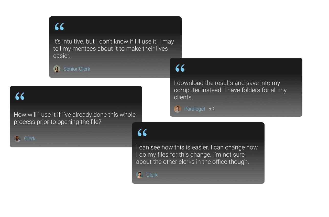
Overcoming reluctance to change and a cluttered interface
The integration was designed to streamline the application process and maintain consistency across our platform among provinces. However, many users experienced with the existing workflow were resistant to the new change and preferred the way it always has been done - applying on the external site and uploading the application to our system manually.
The Solution
The solution needed to streamline the application process, maintain consistency with legacy workflows, and allow flexibility for users to continue working in their familiar ways.
Due to the disorganized navigation and visual clutter, I decided to start my design process by narrowing down the options and guiding the user through a more structured, step-by-step process in order to improve the user experience.
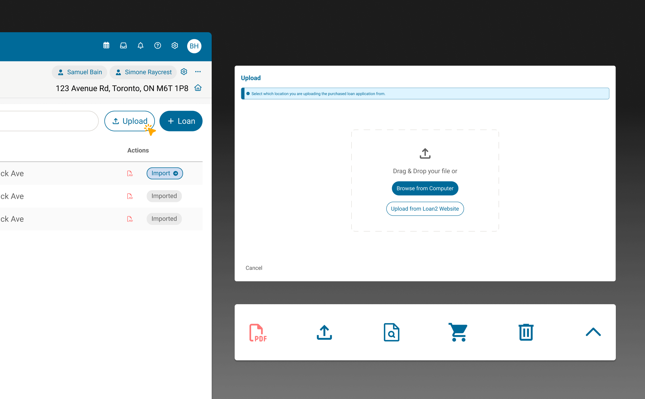
Using Modals for Focus
To ensure users could only interact with the application in a linear and focused way, I used modals to improve navigation. Using progressive disclosure helped reduce the visual clutter and ensured they stayed on track throughout the application process.
Prioritizing Key Touchpoints
I decided to start my design process by thinking about the user’s workflow. My aim was to simplify the process by focusing on the most important actions, guiding the user towards one task at a time and minimizing distractions. This helped them focus on the task at hand — applying for a loan — without getting sidetracked.
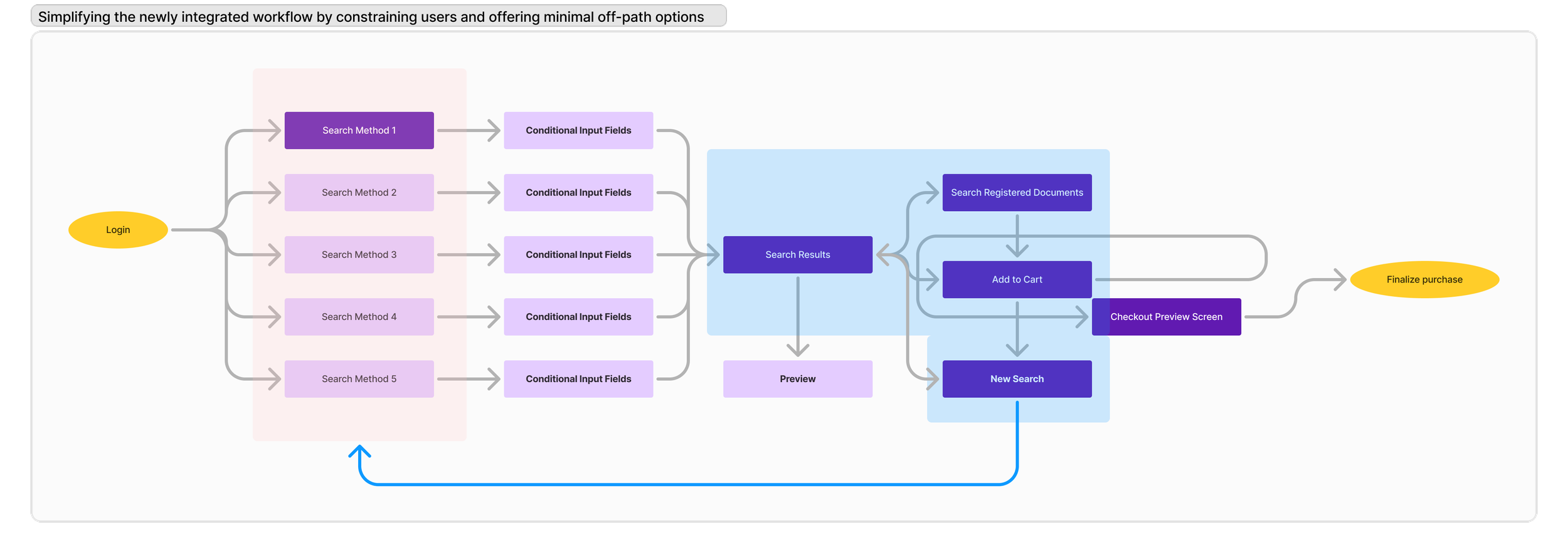
Familiarity and Consistency
To provide flexibility for users who want to continue applying for loan applications using the traditional method, I added an ‘upload’ feature. The ‘upload’ button was placed strategically beside the starting point of the new workflow in order to help slowly introduce resistant users to the new integration feature.
I also incorporated modern e-commerce design elements and common icons that matched other applications, helping users feel more comfortable and confident with their choices while using the application.
Reflection and Opportunities
Navigating User Adoption, Consistency, and Business Growth
After designing the initial streamlined workflow, I initiated client conversations to validate whether it truly improved their process. However, these discussions revealed something more significant: a deep-rooted hesitancy toward change.
This initiative proved invaluable in business discussions. I was able to lead the conversation through the user perspective. Understanding user reluctance firsthand allowed for a more balanced approach in the meetings, ensuring the integration aligned with both business goals and user expectations. Without these insights, the risks of adoption may not have been as clearly recognized.
The business decision was clear: modernization couldn’t be stalled by legacy workflows. Even if adoption was gradual, providing a structured and efficient platform would eventually drive users toward a better workflow. Moving forward with change ensured long-term growth while positioning the company for continued innovation.