Designing a task management system to improve team collaboration

0-1 feature

systems design

scaling design systems

LawyerDoneDeal is a company building legal tech products that optimize workflows for lawyers and law clerks in Canada.

As a product designer, I designed a 0-1 task management feature for Realti, a SaaS application for real estate lawyers, that allows users to create tasks, assign responsibilities, and track progress.

TEAM:

1 product designer

3 developers

3 consultants

Role:

user research

Conceptualization & Design

Product Management

Development Handoff

feature ownership

Post-Launch Evaluation

PROBLEM

Many real estate law firms have continued to perform accounting bookkeeping processes by hand. However, transactions involving real estate depend largely on cheque handling, requiring writing, sending, and documenting numerous cheques daily with large sums.

Daily manual cheque writing can result in numerous opportunities for human error with large amounts of money on the line.

IMPACT

Beta User Positive Feedback

Two law firms who acted as beta users said the cheque printing functionality significantly reduced the time it takes for their firm to prepare cheques.

MVP Design → New Accounting App

The success of the cheque printing functionality gave the company confidence to build its new trust accounting platform around the same core foundation and functionality.

Improved Design System

I used this project to launch new standards in our design system. These standards have now been added into the design system and will guide future software enhancements.

objective

Design a feature for law firms to print bank account information and amounts on two different types of cheques and ensure the final product complies with legal specifications set by the Canadian Payments Association.

Law firms have a choice between carrying pre-printed or blank cheques. File information will need to print perfectly in each section, compliant with measurements set by the Canadian Payments Association regardless of cheque type.

constraints

Firms' bank account information are already saved on the existing software but using legacy code. I will need to integrate this modern cheque printing functionality into an existing legacy workflow.

design exploration

• principles // design north star

Given both the legal and financial landscape of this project, I had to ensure users felt confidence and trust that printing cheques on the software would be legal and bank compliant.

To ensure this message was conveyed to users, I drew on a set of foundational UX psychology practices to guide my design thinking.

Match between system and the real world

Matching physical cheque layouts builds on user familiarity to reduce the learning curve and reinforce confidence in the feature’s legal compliance.

Visibility of system status

Reassures users they’re filling in the virtual cheque correctly by providing clear, continuous feedback that guides them through a new workflow.

• market research

I began looking at similar applications for common workflows and patterns. Interestingly, there were few cheque printing software available. As a result, I looked at industry adjacent software - like word processing.

A common pattern we often use in word processing is choosing to start a document from a blank page, or an established template. I decided to take this as inspiration to begin the cheque printing workflow.

Design exploration to allow users to select template type.

• workflow exploration 1

Using the word processing pattern as inspiration, I decided to design the initial userflow as a gradual process to prevent information overload, where more detailed information is asked gradually throughout the workflow.

• workflow exploration 2

For blank cheques, margin configuration is not as important since the layout can be positioned dynamically to align correctly during printings. However, pre-printed cheques already contain a fixed template on the cheque stock, so users need to ensure their bank details align within the designated printed areas.

Because of this, I added an intermediary configuration screen specifically when pre-printed cheques are chosen, allowing users to adjust and save margins that match their particular cheque stock before printing.

Test prototype to verify workflow with stakeholders.

• iterating post feedback

I tested the prototype with 4 law clerks across 2 law firms in British Columbia resulting in two realizations:

Law firms typically carry only one type of cheque

If firms carry pre-printed cheque stocks, it's rare that they'll have different versions with different fixed templates on them.

Clerks spent a long time aligning margins and conducting test prints

Clerks spent on average an additional 6 min testing out the margins before they were happy with the final product.

With this in mind, I streamlined the workflow by reconfiguring the margin setup steps as an administrative setting such that it only needs to be configured once and is then applied for all users thereafter.

For firms using different cheque stocks across bank accounts, I also allowed cheque configurations to be managed per bank account. This ensures settings are pre-configured in advance, minimizing redundant setup for end users.

Test prototype to verify workflow with stakeholders.

• UI Design decisions

When filling in the cheque details, I designed the interface to visually mirror a real cheque. By aligning the interface to match familiar mental models, this reinforces familiarity, reliability, and trust.

Utilizing UX psychology design principles - match between system and the real world

I aimed to provide the user with immediate feedback whenever possible like allowing them to preview their margin settings and utilizing inline error states to promote user confidence, accuracy, and convey trust.

Utilizing UX psychology design principles - visibility of system status

• design system improvements

Inline error states and matching designs to reality were not design patterns that currently existed within the existing software. I saw this project as a chance to add these features and improve the software’s overall usability in a focused, low-risk setting. These design practices would ultimately end up serving as an implementation guideline for future projects.

Utilizing UX psychology design principles - visibility of system status

• reflection

While adoption has been limited due to many firms relying on external accounting tools, the feature was delivered in just three months by only myself, and one other developer — nearly half the time comparable projects in the backlog had previously taken.

In addition to establishing design practices that guided future projects, this project also delivered meaningful improvements to the platform. It strengthened the software's financial capabilities, improved reconciliation accuracy, and now serves as part of the core package in new product rollouts, helping position the software as a more complete end-to-end solution for law firms.

To support this implementation, I consulted documentation from the Canadian Payments Association and worked closely with the developer to define detailed specifications for this customization functionality.

PROBLEM

After conducting 5 focus group interviews across Canada, I discovered that law clerks lacked a singular, collaborative approach to track tasks across their legal files in their law firm.

Using different methods to manage tasks resulted in missed tasks and deadlines, ultimately highlighting the need for a singular task management system within Realti, the SaaS application for law clerks and lawyers.

IMPACT

Top 10 feature

The task management feature ranks as the 6th most used function across the platform.

Userfriendliness

62% of respondents described the new task management feature as “intuitive and easy to use”

High Adoption

69% of users have used the task management system at least once since launch.

objective

Design a flexible task management system that allows firms to adapt the designed workflow to their processes, while ensuring that configuration remains simple and manageable.

constraints

I was required to incorporate an underutilized legacy file calendaring feature into the new task management system. Formal mid-project research was also limited. Rather than validating design decisions through dedicated user testing cycles, decisions were primarily validated through internal staff who had previously worked as law clerks. While this kept the feedback loop fast, it meant design decisions relied on a small group rather than a broader sample of active users.

workflow exploration

• principles // design north star

During my focus group interviews, 16 of 20 interviewees discussed their hesitancy in adopting new task management practices across their firm. To ensure high adoption of the task management feature and reduce missed tasks, I designed the system around three key principles:

Incorporate known features and workflows

Connect familiar, but related features and workflows into the new feature in order to minimize the adoption gap.

Improve file progress visibility

Reduce missed tasks and deadlines by exposing the user to the file's progress often.

Enable task automation

Reduce repetitive task assignment to promote an easy setup and high feature adoption rate.

• viewing the constraint as an opportunity

I then analyzed the existing file calendaring feature to identify interaction patterns that could be leveraged within the new task management system. The feature allowed users to select key dates from a predefined list and display them on their calendars.

Through this analysis, I found that many of the underlying behaviors like deciding what appears on a calendar were already closely aligned with the needs of task management. Rather than designing a new calendaring experience from scratch, I explored how this existing workflow could be adapted to surface tasks and due dates. This approach helped maintain familiarity for users while reducing implementation complexity. It became the start of the workflow.

Utilizing the existing legacy functionality to surface tasks and due dates in order to maintain familiarity and reduce development time.

• improve file progress visibility

As I continued my exploration, I focused on increasing the visibility of tasks and file progress across the software. By analyzing how users interacted with their files, I found that important file information was often hidden behind multiple layers of navigation.

Currently, users must navigate into each file individually — across 200+ active files, tasks are easy to miss.

To reduce the likelihood of missed tasks, I explored ways to surface task information at key points in the workflow, including the home dashboard, file home pages, and supporting screens such as the calendar.

There are multiple entry points in the software to view assigned tasks by user. Tasks now surface at three levels— on the login dashboard, inside each file, and in the calendar.

• incorporating known features (internal research)

I continued my design exploration by identifying commonly used features within the software that could inform the new task management experience. My goal was to leverage existing workflows that users already understood, reducing the amount of new behavior they would need to learn.

One of the most heavily used features was Notes, where users communicate with one another, assign responsibility through messages, and track whether a message has been read.

When mapping behaviors involved in task management, I found several parallels: assigning work, communicating status, and tracking completion. These shared interaction patterns made Notes a strong candidate to incorporate into the new feature.

The notes feature on the Tools Panel is heavily used by users to communicate with each other. It has very similar functionalities you would expect in a task management system - assigning tasks to one another via messages and marking as read/complete.

design iterations

Portrait
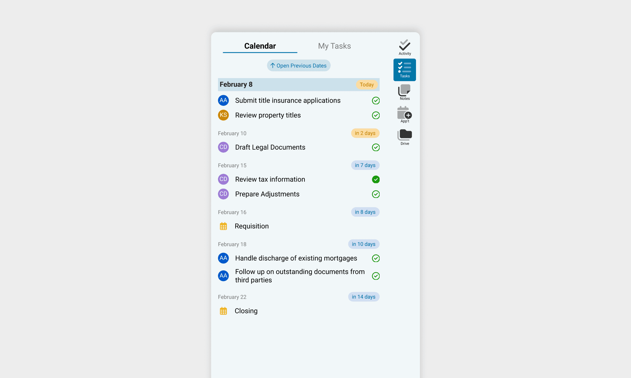
Scrollable Timeline View Starting from Today
✅ View user specific tasks and due dates ⚠️ Technical programming constraints jumping to previous dates ❌ Difficult to parse for overdue tasks
Iteration 1
Portrait
Static Page View
⚠️ Technical programming constraints jumping to previous dates ❌ Difficult to parse for overdue and previous tasks
Iteration 2
Portrait
Highlighting Overdue Tasks
⚠️ Overdue tasks highlighted at the top ❌ Multiple clicks required to view previously assigned tasks ❌ Can’t view tasks assigned to yourself at a glance
Iteration 3
Portrait
Easy Filter for Your Tasks
✅ Overdue tasks highlighted at the top ✅ Filter for your own tasks
Final Iteration

I explored designs that accomplished key functionalities of a checklist while allowing users to quickly filter for their own tasks and address overdue tasks easily.

The main challenge was giving both overdue/ past tasks and upcoming tasks clear, but differentiating importance through visual hierarchy. I ultimately prioritized overdue tasks by placing them at the top, as they require immediate action, and enabled task filtering by user to support personal accountability. Secondary actions were intentionally de-emphasized by placing them behind additional interactions and outside the primary view, reducing cognitive load and keeping focus on urgent work.

Another core part of any task management system is a calendar that provides a visual overview of all tasks, events, and due dates.

The main challenge in designing the calendar was balancing information density with decision-making clarity. I initially explored a minimal layout to reduce visual overload, but clients expressed that hiding key details actually slowed decisions and increased uncertainty.

Truncating event text allowed all 30 date slots to fit on one screen, but users couldn't read their information without hovering. After back and forth with clients, I prioritized legibility over density — users now scroll to see all events, but make decisions with full context visible.

final designs

Using our existing design system, I designed an interface allowing administrators to create templates where tasks could be set up once and automated to show across all future files. This would streamline the process of assigning tasks in the future, and reduce missed deadlines. Doing it once will help maintain a low learning curve for our users.

The notes feature on the Tools Panel is heavily used by users to communicate with each other. It has very similar functionalities you would expect in a task management system - assigning tasks to one another via messages and marking as read/complete.

The notes feature on the Tools Panel is heavily used by users to communicate with each other. It has very similar functionalities you would expect in a task management system - assigning tasks to one another via messages and marking as read/complete.

impact

Since launch, the task management feature has become the 6th most used function across the entire platform — tracked through Appcues — signalling strong and sustained adoption well beyond the initial rollout.

Post-launch survey results reinforced this: 62% of respondents described the system as intuitive and easy to use, and 69% had used it at least once. I guided our intern in gathering over 70 survey responses, consolidated the feedback into themes, and converted findings directly into backlog tickets to drive the next round of enhancements.

©2026 debbie

©2026 debbie

©2026 debbie